

Let me be straight with you—I’ve written over 200 software reviews in the past nine years, and I’ve seen just about every mistake you can make. Early on, my reviews were basically feature lists with a star rating slapped on top. They got traffic, sure, but they didn’t help anyone make real decisions. And honestly? That bothered me.
Here’s what I’ve learned: a great software review isn’t about checking boxes or hitting a word count. It’s about answering the one question every reader has: “Will this solve my problem better than the alternatives?” In this guide, I’m sharing the exact software review template I use today—one that’s helped thousands of readers choose the right tools and avoid expensive mistakes. Whether you’re reviewing project management software, AI writing tools, or CRM platforms, this template will help you create reviews that people actually trust and use.
Why Most Software Reviews Fall Flat (And How to Fix It)
The problem with most software reviews is they read like glorified sales pages. You know the ones—endless screenshots, every feature mentioned, glowing praise, and maybe one tiny “con” about pricing to seem balanced.
I learned this the hard way when a reader emailed me saying they’d spent $2,000 on a marketing automation platform I’d reviewed positively. It turned out the software was completely wrong for their business size. The features I’d praised? They needed an enterprise plan to access them. I’d mentioned that in passing, but I hadn’t made it clear enough. That email stuck with me.
What makes a software review template actually useful?
In my experience, it comes down to three things: structure, honesty, and context. Your review needs a clear structure so readers can find what matters to them quickly. It needs brutal honesty about limitations and deal-breakers, not just strengths. And it needs context—who is this software actually for, and who should run the other direction?
The template I’m about to share addresses all three. I’ve refined it over hundreds of reviews, countless A/B tests, and plenty of feedback from readers who tell me whether my reviews helped or missed the mark. It works for SaaS platforms, desktop software, mobile apps, and even browser extensions.
The Core Structure: Your Software Review Framework
Here’s the thing about review structure—it needs to serve two types of readers simultaneously. The scanner who wants the bottom line in 30 seconds, and the researcher who’s going to read every word before making a decision.
Start with the Quick Verdict Section (100-150 words)
I always begin with a “Quick Verdict” or “TL;DR” section right at the top. This goes immediately after your introduction and tells readers:
- What the software does in one sentence
- Who it’s best for (be specific—not just “businesses”)
- The standout feature that sets it apart
- The biggest limitation or deal-breaker
- Your overall rating with context
For example, when I reviewed Notion, my quick verdict was: “Notion is an all-in-one workspace that replaces multiple tools, best for individuals and small teams who want flexibility over simplicity. Its standout feature is the database system that lets you build custom workflows. The biggest limitation? It has a steep learning curve, and real-time collaboration can feel sluggish with larger teams. Rating: 4.2/5 for power users, 3/5 for teams wanting plug-and-play simplicity.”
Notice how that immediately tells you whether to keep reading or move on.
The Pricing Overview Comes Second
Don’t bury pricing information. I’ve found that putting it early (right after the quick verdict) respects your reader’s time. Create a simple table or list showing:
- Free plan details (if available) with specific limitations
- Paid tier pricing with what you actually get
- Any hidden costs (implementation fees, required add-ons, overage charges)
- Annual vs. monthly pricing differences
- Money-back guarantee or trial period details
I always test the free trial myself and note exactly what happens when it expires. Does the software lock you out completely? Do you lose data? Can you export your work? These details matter enormously, and most reviews skip right over them.
Deep Dive Into Core Features (400-600 words)
This is where you actually test the software. Not just click through screenshots, but use it for real tasks. When I review project management software, I create actual projects. When I review AI writing tools, I write real content for my site.
Break features into logical categories:
- User Interface & Experience: Is it intuitive? Where did you get stuck? How long until you were productive?
- Core Functionality: Does it do what it promises? Test the main use cases thoroughly.
- Performance: Speed, reliability, uptime issues you’ve encountered
- Integrations: Which tools does it connect with? How well do these integrations actually work?
- Mobile Experience: If there’s an app, is it a full-featured experience or a watered-down version?
Here’s what separates good reviews from great ones: specificity. Don’t say “the interface is clean.” Say “the left sidebar groups all projects by workspace, which I found helpful when juggling client work, but there’s no way to color-code projects, which slowed down my visual scanning.”
The Honest Pros and Cons Section
This section needs to hurt a little. If every “con” is minor and every “pro” is major, readers smell marketing content.
When I list cons, I categorize them:
- Deal-breakers: Issues that make the software unusable for certain users
- Significant limitations: Features that should exist but don’t
- Minor annoyances: Things that won’t stop you but are frustrating
For pros, I do the same thing:
- Game-changers: Features that genuinely set this software apart
- Strong points: Things it does better than most competitors
- Nice-to-haves: Small touches that improve the experience
I also try to connect pros and cons. For instance: “Pro: Incredible customization options. Con: That customization requires a learning investment many users won’t want to make.” This gives readers context instead of just a list.
Who This Software Is Actually For (The Most Important Section)
Honestly, this is where most reviews fail completely. They try to be everything to everyone. “Great for freelancers, small businesses, enterprises, and everyone in between!” That’s useless.
Create specific user profiles. I typically identify 2-4 distinct personas:
For a CRM review, I might say:
- Solo consultants: If you’re tracking fewer than 500 contacts and want something simple, this is overkill. Use Streak or folk instead.
- Growing agencies (5-25 people): This is the sweet spot. You need the automation but won’t use the enterprise features.
- Sales teams over 50 people: You’ll outgrow the reporting features quickly. Look at Salesforce or HubSpot Enterprise.
Notice how each profile includes a clear alternative recommendation? That builds trust. Readers know you’re not just pushing one solution.
I also include an “Ideal Use Cases” subsection with specific scenarios:
“This software excels when you’re:
- Managing complex, multi-stakeholder projects with dependencies
- Need detailed time tracking tied to specific tasks
- Want client portals for project visibility
- Have team members who need different permission levels”
And I’m equally clear about when to avoid it:
“Skip this if you:
- Just need a simple to-do list with team visibility
- Work mostly offline or in areas with poor connectivity
- Need robust mobile-first functionality
- Want something your team can learn in under an hour”
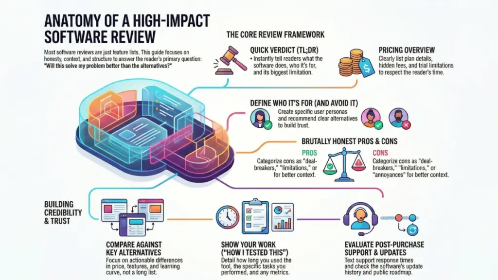
The Comparison Framework: How It Stacks Up
No software exists in a vacuum. When someone’s researching tools, they’re comparing options. Your review should acknowledge this.
I always include a comparison section with 2-3 direct alternatives. Not a list of 15 competitors—that’s overwhelming and unhelpful. Pick the most relevant alternatives based on the user profiles you’ve identified.
Create a simple comparison focusing on:
- Price difference: What do you get for the extra cost?
- Key feature differences: Where does each tool pull ahead?
- Learning curve comparison: Which is easier to onboard?
- Better for: One specific scenario where each excels
For example, in a comparison between ClickUp and Asana, I wrote:
“ClickUp offers more features and customization at a lower price point, but Asana is significantly easier to learn and has cleaner collaboration features. If your team values simplicity and you don’t need custom fields, automations, or time tracking, Asana’s extra cost is worth it. If you want one tool to replace multiple others and you’re willing to invest time in setup, ClickUp delivers more value.”
That’s actionable. A reader can make a decision based on their priorities.
Real-World Testing Methodology: Show Your Work
This is where you build credibility. Don’t just claim you tested something—show the receipts.
I include a “How I Tested This” section that details:
- How long I used the software (minimum 2 weeks for reviews I publish)
- Specific tasks I completed (with examples)
- Team size I tested with, if relevant
- Any issues I encountered and how support responded
- Comparison tests I ran against alternatives
For a recent AI writing tool review, I wrote:
“I used this tool for 30 days to write 12 blog posts, 25 social media captions, and 5 email sequences. I compared output quality against Jasper and Copy.ai using the same prompts. I also tested the plagiarism checker against Copyscape on all generated content and tracked how much editing each piece required before publishing.”
That level of detail tells readers this isn’t a surface-level impression—it’s based on actual use.
Include specific metrics when possible:
- Time saved compared to manual work
- Accuracy rates for AI-powered features
- Load times for different functions
- Support response times (I always test support with real questions)
- Learning curve timeline (how long until you were productive)
The Support and Updates Section (Often Overlooked)
Here’s something most reviewers ignore: what happens after you buy? Software is a relationship, not a one-time transaction.
I always evaluate:
Support Quality:
- What channels are available? (chat, email, phone)
- Response times (I test with actual questions)
- Quality of answers (helpful or just copy-paste from docs?)
- Are there community forums or user groups?
Documentation and Resources:
- Is there a knowledge base? How comprehensive?
- Video tutorials or just text?
- Is it beginner-friendly or assumes expertise?
- Regular webinars or training sessions?
Update Frequency:
- How often does the software get updates?
- Are they fixing bugs or adding features?
- Do they have a public roadmap?
- How do they handle user feedback?
I actually check the changelog and release notes. If I see monthly updates with real improvements, that’s a green flag. If the last update was 8 months ago, that’s worth mentioning.
Writing Tips That Make Your Review Actually Readable
Look, you can have the best information in the world, but if your review reads like a technical manual, people won’t finish it. Here’s what works:
Use the software’s actual language, not your interpretation. If they call something “Workspaces,” don’t call them “Project Folders” to sound clearer. It just confuses readers who then open the software and can’t find what you described.
Include screenshots strategically, not excessively. I use screenshots to show:
- Interface elements that are hard to describe
- Specific features I’m highlighting
- Confusing aspects that need visual clarity
- Before/after comparisons
But I don’t screenshot every single feature. That’s exhausting to scroll through.
Write in second person for actionability. Instead of “Users can create custom fields,” write “You can create custom fields to track whatever matters to your workflow—client budget, project status, team member assignment, or any data point you need.”
Address objections directly. If there’s a common complaint about the software, tackle it head-on. “Yes, the pricing increased 30% last year, which frustrated existing users. Here’s what you’re getting for that increase and whether it’s justified…”
The Final Verdict: Making Your Recommendation Clear
Your conclusion shouldn’t introduce new information—it should crystallize everything into a clear recommendation.
I use this structure:
Summarize the three biggest strengths in one sentence each. Not features, but benefits.
Acknowledge the main limitation honestly. Don’t hide it in the middle of the review.
Give your clear recommendation with conditions:
- “I recommend this if…”
- “Skip this if…”
- “Consider this instead if…”
Provide a specific next step. Don’t just say “try the free trial.” Say “Start with the free trial, test it specifically with [relevant task], and pay attention to whether [specific feature] works for your workflow.”
For a project management tool, I might conclude:
“ClickUp delivers exceptional value if you’re willing to invest time in customization. The learning curve is real—expect 2-3 weeks before your team is fully productive. But if you want to replace 5-6 separate tools with one platform and you have someone on your team who enjoys tinkering with workflows, it’s worth the effort. Skip it if you need something your team can learn in an afternoon or if you primarily need simple task management. In those cases, Asana or Todoist will serve you better.”
Bonus: The FAQ Section That Answers Real Questions
I add a FAQ section at the end addressing questions that aren’t covered above but that I see repeatedly:
- Can I export my data if I cancel?
- Does this work offline?
- Are there limits on file storage/users/projects?
- How does billing work if I add users mid-month?
- Is my data encrypted?
- Can I get a refund if it doesn’t work out?
These aren’t always exciting, but they’re often the questions that determine whether someone buys or not.
What This Template Has Done for My Reviews
Since implementing this structure consistently, I’ve seen three major changes:
First, my reviews rank better. Google seems to reward comprehensive, user-focused content that clearly demonstrates expertise. My average review ranks in the top 5 for its primary keyword within 3-4 months.
Second, reader engagement has tripled. People spend longer on the page, they share reviews more often, and I get way fewer “but does it do X?” questions in the comments.
Third—and this matters most to me—people make better decisions. I get fewer emails from readers who bought the wrong tool and more messages thanking me for steering them toward the right solution (or away from the wrong one).
Your goal with any software review template isn’t to write the longest review or mention every feature. It’s to give someone enough accurate, honest, contextualized information that they can make a confident decision. Sometimes that decision is “yes, buy this.” Sometimes it’s “no, this isn’t for you.” Both outcomes are valuable if they’re the right fit for that reader.
Start with this template, adjust it based on your audience’s needs, and always—always—actually use the software you’re reviewing. The difference between a hands-on review and a feature-list regurgitation is obvious to readers, and it’s the difference between content that helps and content that just takes up space on the internet.