

I’ve been writing software reviews for marketing tools for about four years now, and I’ll tell you something that might surprise you: most software reviews are basically useless. They either read like the company wrote them, or they’re so vague you can’t actually figure out if the tool will work for your specific situation.
After writing detailed reviews for over 150+ marketing and productivity tools—and making some expensive mistakes along the way—I’ve developed a template that actually helps people make informed decisions. This isn’t about gaming SEO or collecting affiliate commissions. It’s about creating reviews that answer the real questions people have when they’re about to drop $50, $500, or $5,000 on software.
In this guide, I’ll walk you through exactly how to structure a software review that provides genuine value. Whether you’re reviewing project management tools, AI writing assistants, or accounting software, this template will help you create content that people actually want to read—and that genuinely helps them decide if a tool is right for them.
Why Most Software Reviews Miss the Mark
Here’s the thing: I read a lot of software reviews when researching tools for clients, and most of them fall into one of three categories.
First, there are the glorified feature lists. These reviews just regurgitate what’s on the company’s website. “This tool has project management capabilities, time tracking, and team collaboration features.” Great—I could have read that on their homepage in 30 seconds.
Second, you’ve got the everything-is-amazing reviews. These are either affiliate-driven or just lazy. Every feature is “intuitive,” every interface is “clean,” and somehow there are zero drawbacks. If you’ve ever actually used software, you know this is nonsense. Every tool has limitations, annoying quirks, or situations where it’s just not the right fit.
Third—and these are actually more helpful but still incomplete—are the personal diary reviews. “I used this for my freelance design business and loved it!” That’s genuinely useful context, but if I’m running a 20-person marketing agency, your solo freelancer experience might not translate to my needs.
What I’ve found is that the best software reviews do something different. They acknowledge that the “best” tool depends entirely on your specific situation, they’re honest about both strengths and real limitations, and they provide enough specific detail that readers can mentally test-drive the software before buying.
The Essential Components of a Helpful Software Review
Before we dive into the actual template, let me break down the key elements that make a software review genuinely useful. I learned most of these the hard way—after writing reviews that got comments like “This didn’t answer my actual question” or “I bought this based on your review and it was nothing like you described.”
Start With Who It’s For (And Who It’s Not For)
This might be the most important piece that most reviews skip. Every software tool is built with certain users in mind. Notion is fantastic for knowledge workers who want flexibility, but it’s overkill (and honestly confusing) for someone who just needs a simple task list.
I always start by clearly stating the ideal user profile. Not in a vague “this is for businesses” way, but specifically: “This works best for content teams of 3-10 people who need to collaborate on blog posts and manage an editorial calendar, but probably have a dedicated project management tool for everything else.”
Just as importantly, I call out who should look elsewhere. “If you’re a solo blogger just starting out, the $99/month price tag is steep and you’d be better off with [alternative] until you scale up.” This saves people time and builds trust—you’re clearly not just trying to get everyone to buy everything.
Provide Real-World Context About Your Testing
When I review a tool, I explain exactly how I tested it. “I used this daily for three months while managing content for five different client accounts” tells you way more than “I tested this extensively.”
Here’s what I’ve learned: people want to know if your use case resembles theirs. If you tested a CRM for a week with fake data, that’s very different from running your actual sales pipeline through it for six months. Be honest about your testing methodology—it helps readers calibrate how much weight to give your opinions.
I also mention what I was comparing it against. “I switched to this from Trello” or “I tested this alongside Monday.com and ClickUp” gives readers important context about your frame of reference.
Get Specific About Pricing (And Hidden Costs)
Look, pricing matters. A lot. And it’s not just about the monthly subscription fee.
I break down pricing in detail: what each plan includes, where the important limitations are, and what hidden costs might crop up. For example, “The basic plan looks affordable at $29/month, but it only includes 5 users. Each additional user is $9/month, which means for a team of 15, you’re actually looking at $119/month—not $29.”
I also call out things like: Does the price jump significantly at renewal? Are there setup fees? Do you need to pay extra for integrations or API access? Is there a cheaper annual plan? Can you actually test the important features in the free trial, or do those require the enterprise plan?
To be completely honest, I’ve been burned by tools that looked affordable until I realized essential features were locked behind “contact sales” enterprise tiers. I try to save readers from that frustration.
Show, Don’t Just Tell
This is where screenshots and specific examples become crucial. Instead of saying “the interface is intuitive,” I’ll show a screenshot of the actual workflow and explain: “When you want to create a new project, you click this button in the top right, fill out these three fields, and you’re done. The whole process takes about 20 seconds.”
I describe specific scenarios: “Last month, I needed to bulk-import 200 contacts from a CSV file. Here’s exactly how that process worked…” Then I walk through it step-by-step, including any hiccups I encountered.
Real examples beat vague descriptions every time. “The reporting is powerful” means nothing. “You can filter your data by date range, user, project type, and custom tags, then export to Excel or schedule automatic weekly reports” is actually useful information.
Be Honest About What Frustrated You
Here’s where a lot of reviews lose credibility: they gloss over or ignore legitimate problems. I make a point to call out things that genuinely annoyed me during testing.
Maybe the mobile app is clunky. Maybe customer support took three days to respond to a simple question. Maybe there’s a feature that should work but has weird limitations. Maybe the UI looks modern but requires too many clicks for common tasks.
I timed it once: in one tool I reviewed, changing a simple setting required clicking through three different menus and took about 40 seconds. For something you might do 20 times a day, that’s real productivity loss. I included that in my review because it’s the kind of thing that drives you crazy after a month of daily use but might not be obvious in a demo.
The key is being fair. I explain whether the issue is a dealbreaker or just a minor annoyance, and for whom. “If you’re only using this feature occasionally, it’s fine. But if this is a core part of your workflow, it’ll get frustrating fast.”
Compare It to Alternatives (Fairly)
No tool exists in a vacuum. When someone is researching software, they’re usually comparing multiple options.
I directly address how the tool stacks up against major competitors. Not in a “X is better than Y” way, but more nuanced: “Compared to Notion, this tool is less flexible but significantly easier to learn. If you want something your whole team can use on day one without training, this wins. If you need heavy customization, Notion is probably better.”
I also suggest alternatives for different use cases. “If you’re a large enterprise, consider [X]. If you’re budget-conscious, check out [Y]. If you need this specific feature, [Z] might be a better fit.”
This doesn’t cannibalize your review—it builds trust. Readers know you’re trying to help them find the right solution, not just push one specific tool.
The Complete Software Review Template
Alright, here’s the actual structure I use. This template has evolved through dozens of reviews and countless reader questions. It covers everything people actually want to know when evaluating software.
Section 1: Introduction and Overview (200-300 words)
Start with a hook that addresses a real problem or question. Then quickly establish:
What the software does in one clear sentence. Not marketing speak—just what it actually does.
Who it’s designed for specifically. “Content marketers managing multiple blogs” is better than “businesses needing content tools.”
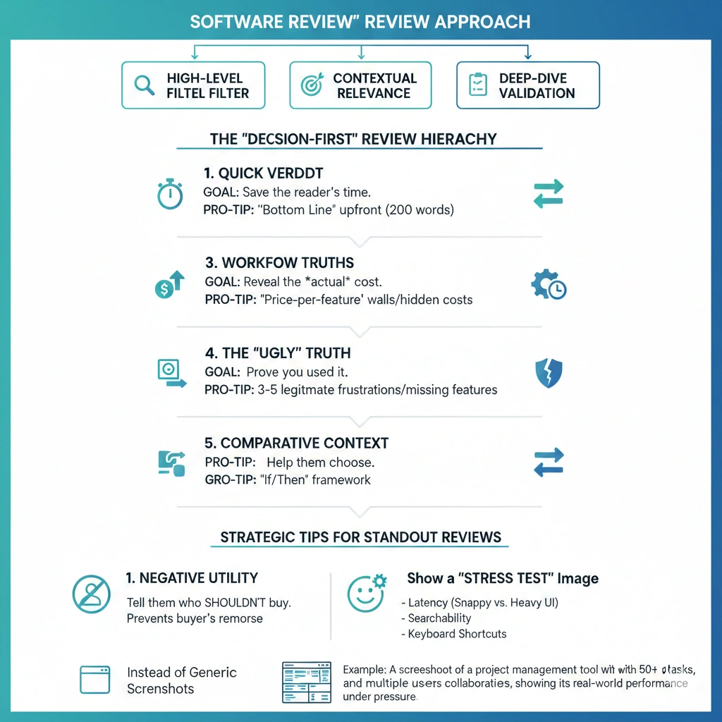
Your quick verdict upfront. I know some people say to build suspense, but honestly, busy readers appreciate knowing your bottom line immediately. You can say something like: “After three months of daily use, I’d recommend this for mid-sized teams but suggest alternatives for solo users or enterprises.”
Your testing context briefly. “I tested this for 90 days managing five client accounts” or “I migrated my entire team of 12 to this platform and used it for a complete quarter.”
This section sets expectations and helps readers quickly determine if the rest of the review is relevant to them.
Section 2: Pricing Breakdown (200-250 words)
Get into the numbers early because it’s often a deciding factor.
Present the pricing tiers in a clear format. For each plan, note:
- Monthly cost (and annual if there’s a discount)
- Key features included
- Important limitations (user limits, storage caps, feature restrictions)
- Who each tier is actually designed for
Call out any catches: “The Pro plan looks like the sweet spot, but video uploads are limited to 10 minutes unless you upgrade to Enterprise.” Or: “There’s a free plan, but it’s really just a 14-day trial—it converts to paid automatically.”
Mention if there are additional costs: implementation fees, per-user charges beyond certain limits, costs for integrations or API access, premium support charges.
Compare value to alternatives briefly: “At $89/month for a 10-person team, this is more expensive than Trello ($10/user) but cheaper than Monday.com ($12/user) with similar features.”
If relevant, discuss the free trial: Can you actually test the features that matter during the trial? Do they ask for a credit card upfront? How easy is it to cancel?
Section 3: Key Features and Capabilities (400-600 words)
This is where you go deep on what the software actually does. I typically focus on 5-7 core capabilities rather than listing every feature.
For each major feature area:
Describe what it does in plain language with specific examples. “The task automation lets you create workflows where, for example, when a task is marked ‘Complete,’ it automatically moves to a review board and notifies the project manager.”
Explain how well it works based on your experience. “The automation builder is genuinely intuitive—I set up my first workflow in about 10 minutes without watching tutorials. More complex multi-step workflows took some trial and error, but the interface gives you clear feedback when something won’t work.”
Include real use cases from your testing. “I set up an automation that creates a new task every Monday morning, assigns it to the rotating team member, and sets a Friday deadline. It’s saved me about 30 minutes of manual work each week.”
Note any limitations you discovered. “You can’t currently trigger automations based on custom field values, which would be really useful for our workflow. The team says it’s on the roadmap.”
The features I always cover (when relevant):
- User interface and ease of use
- Core functionality (what it’s primarily built to do)
- Collaboration and team features
- Integrations with other tools
- Mobile experience
- Reporting and analytics
- Customization options
- Security and permissions
What surprised me most when I started writing these detailed feature sections: readers really appreciate when you mention small quality-of-life details. Things like “you can use keyboard shortcuts for almost everything” or “it auto-saves every few seconds so I’ve never lost work” or “the search is genuinely fast and finds what I need.”
Section 4: User Experience and Interface (250-350 words)
This section focuses on what it’s actually like to use the software day-to-day.
First impressions and learning curve: How long did it take you to feel comfortable? Did you need to watch tutorials? Is there good onboarding?
I’ll usually say something like: “The interface follows familiar patterns—if you’ve used Asana or Trello, you’ll feel at home immediately. I was productive within an hour and felt like I understood 80% of the features within a week.”
Daily usage reality: What’s it like after the novelty wears off? This is where you mention if things that seemed minor become annoying, or if features you thought you wouldn’t use become essential.
Mobile experience: If relevant to the software type, how does it work on mobile? Is the app full-featured or stripped down? Are there things that are genuinely better on mobile?
Performance and reliability: Does it load quickly? Any bugs or crashes? Have you experienced downtime?
Design and aesthetics: Look, this matters more than people admit. Is the interface pleasant to look at when you’re using it 40 hours a week? Is information dense or sparse? Are important actions obvious or hidden?
I try to include a screenshot or two here showing the actual interface during real work—not just the marketing website’s polished screenshots.
Section 5: What Works Really Well (300-400 words)
Here’s where you highlight the genuine strengths. I usually identify 3-5 things the software does exceptionally well.
Be specific about why each strength matters: “The template library is genuinely useful—not just marketing fluff. I’ve used the content calendar template, modified it for three different clients, and saved hours of setup time. They clearly built these based on real user needs.”
Include concrete examples: “The collaboration features really shine when you’re working on a document simultaneously with teammates. I can see their cursors, suggestions appear in real-time, and we’ve had entire editing sessions without a single Slack message. It’s genuinely faster than our old back-and-forth workflow.”
Mention strengths that might not be obvious from the marketing materials: “What I didn’t expect to love: the global search is incredibly fast and accurate. I can find anything I’ve ever created in seconds, even in a workspace with thousands of items. This seems like a small thing but it’s become essential to how I work.”
If the software does something notably better than competitors, call it out: “The reporting is leagues ahead of similar tools in this category. Instead of basic charts, you get customizable dashboards with real-time data that actually help you make decisions.”
Section 6: Limitations and Drawbacks (300-400 words)
Okay, this is the section that separates helpful reviews from marketing disguised as reviews. Every tool has limitations—pretending otherwise destroys your credibility.
I typically identify 3-5 legitimate drawbacks. For each, I explain:
What the limitation is specifically: “There’s no offline mode. If your internet drops, you can’t access any of your data or work until you’re back online.”
Why it matters: “For me, this was a problem when working from coffee shops with spotty wifi. I’ve lost productivity time waiting for connections to stabilize.”
Who it affects most: “If you’re always in an office with reliable internet, this probably won’t bother you. But for remote workers or frequent travelers, it’s worth considering.”
Whether there are workarounds: “You can export important documents as PDFs to have offline copies, but you can’t edit them offline and sync changes later.”
Common limitations I look for:
- Missing features you’d expect
- Performance issues with large data sets
- Poor mobile functionality
- Confusing or cluttered interface elements
- Weak customer support
- Limited integration options
- Restrictive pricing tiers
- Steep learning curve for advanced features
I learned this the hard way: if you discover a significant limitation after publishing a review, update it. I’ve added notes like “Update: Since writing this review, they’ve added the bulk export feature I mentioned was missing” or “Update: The mobile app issues I noted have not been fixed in six months, which is disappointing.”
Section 7: Customer Support and Resources (150-200 words)
This section often gets overlooked, but when something goes wrong, support quality matters a lot.
Share your actual experience: “I contacted support twice during testing. First time, I got a response in about 4 hours with a detailed answer that solved my problem. Second time, it took two days and the response was generic—clearly they hadn’t read my question carefully.”
Mention what resources are available:
- Quality and comprehensiveness of documentation
- Video tutorials or knowledge base
- Community forums or user groups
- Availability of live chat vs. email-only support
- Whether there’s dedicated support for higher-tier plans
If you’ve explored it: “The knowledge base is actually well-written and searchable. I found answers to most of my questions there without needing to contact support.”
Section 8: Integrations and Ecosystem (150-200 words)
For most software, how well it plays with your other tools is crucial.
List the major integrations that actually work well: “Native integrations with Slack, Google Workspace, and Salesforce. The Slack integration is particularly solid—notifications are timely and you can take actions directly from Slack without opening the app.”
Note any important missing integrations: “Surprisingly, no native HubSpot integration as of this writing. You can use Zapier as a bridge, but that adds cost and complexity.”
Comment on the API if relevant: “There’s a well-documented API, and I’ve used it to build custom automations. It’s RESTful and the documentation includes practical examples, not just technical specs.”
Mention if the ecosystem is growing: “They’ve added 15 new integrations in the past six months, which suggests they’re actively investing in connectivity.”
Section 9: Who Should (and Shouldn’t) Buy This (250-300 words)
This is where you bring everything together with clear, specific recommendations.
Best for: Create 2-3 specific user profiles who would genuinely benefit. “This is ideal for content marketing teams of 5-20 people who need to collaborate on blog posts, manage an editorial calendar, and track content performance—all without juggling multiple tools.”
Explain why: “The combination of writing collaboration, calendar management, and built-in analytics means you can handle your entire content workflow in one place. For a team that size, the time savings are significant and the per-user cost is reasonable.”
Not recommended for: Be equally specific about who should look elsewhere. “If you’re a solo blogger or freelance writer, this is probably overkill. The features designed for team collaboration won’t benefit you, and the $79/month starting price is steep for an individual.”
Alternative recommendations: “Solo users should consider [Alternative A]. Larger enterprises needing more advanced security features should look at [Alternative B]. Teams focused primarily on social media rather than long-form content might prefer [Alternative C].”
I sometimes include edge cases: “If you absolutely need [specific feature], this won’t work—consider [Alternative]. But if you can live without that feature, everything else about this tool is excellent.”
Section 10: Final Verdict and Recommendation (150-200 words)
Wrap up with your clear bottom-line assessment.
Restate your overall opinion: “After three months of daily use managing real client work, I’d confidently recommend this for mid-sized marketing teams looking to streamline their content workflow.”
Acknowledge any caveats: “The pricing is at the higher end of this category, but the time savings and consolidation of multiple tools justifies the cost for most teams.”
Suggest the next step: “If you’re considering this, I’d recommend signing up for the free trial and specifically testing [these key workflows] that will make or break the decision for your use case.”
End with a clear call: “For teams in the sweet spot (5-20 people, regularly creating content, need collaboration features), this is honestly a no-brainer. For everyone else, revisit the alternatives section above to find a better fit.”
How to Maintain Review Quality Over Time
Here’s something nobody tells you about writing software reviews: your work isn’t done when you hit publish. Software changes constantly—new features get added, bugs get fixed (or appear), pricing changes, competitors emerge.
I revisit my reviews every 6-12 months to check if they’re still accurate. Sometimes this means minor updates (“Update: They’ve added the bulk export feature I mentioned was missing”). Sometimes it means significant rewrites if the product has evolved substantially.
I also pay attention to reader comments and questions. If multiple people ask about something I didn’t cover, I add a section addressing it. If someone points out an error or shares a different experience, I investigate and update accordingly.
The software reviews that get the most traffic and conversions are the ones that stay current. A review from 2020 that hasn’t been updated is effectively useless for most modern software—things just change too fast.
Common Mistakes to Avoid
After writing over 150 reviews and reading hundreds more, I’ve noticed patterns in what makes reviews unhelpful. Here are the biggest mistakes I see (and that I’ve made myself):
Testing too briefly: Using software for a day or even a week often isn’t enough to understand its strengths and limitations. If possible, use it for real work over at least a month.
Not disclosing bias: If you’re getting paid for the review, if it’s an affiliate link, if you’ve used the tool for years and love it—be transparent. Readers aren’t stupid.
Over-focusing on features, under-focusing on experience: A feature list isn’t a review. How those features work in practice, what the experience is like, what problems they solve—that’s what matters.
Ignoring the competition: Writing about software in a vacuum doesn’t help anyone. People want to know how it compares to alternatives they’re already considering.
Being vague about downsides: “It has a learning curve” or “it’s expensive” tells me nothing. How steep? Expensive compared to what? For whom?
Forgetting to update: Publishing and forgetting means your review becomes less useful every month.
Making Your Reviews Stand Out
Look, the internet is flooded with software reviews. Most are mediocre at best. Here’s what I’ve found actually makes reviews stand out and get shared:
Video walkthroughs: If you can add a screen recording showing the software in action, do it. Seeing the actual interface and workflow answers questions that text can’t.
Comparison tables: When reviewing similar tools, a clear comparison chart is incredibly valuable. I have a few reviews with detailed comparison tables that get referenced constantly.
Specific use-case scenarios: Walk through exactly how someone would use the tool for a specific purpose. “Here’s how you’d use this to manage a product launch” with step-by-step details.
Honest mistakes and lessons: Share what you got wrong initially or what you learned the hard way. “I thought I needed the Pro plan but realized after a month that the Basic plan had everything I actually used.”
Long-term updates: Coming back after 6 months or a year to add “Long-term update: After using this for a year, here’s what changed in my opinion” adds massive credibility.
The Real Goal of Software Reviews
To be completely honest, I think most people writing software reviews miss the point. The goal isn’t to describe software—it’s to help people make better decisions.
Every time I write a review, I imagine someone sitting there with their credit card, about to make a purchase that might be a great fit or a complete waste of money. My job is to give them the information they need to make that decision confidently.
That means being honest about limitations, clear about who it’s for, specific about costs and value, and genuinely helpful rather than just trying to rank for keywords or earn commissions.
The reviews I’m most proud of are the ones where someone comments “This helped me decide this wasn’t right for me, and I went with your alternative suggestion instead.” That’s success—helping someone avoid a bad fit is just as valuable as helping them find a good one.
Your Next Steps
If you’re about to write a software review using this template, here’s what I’d suggest:
First, actually use the software properly. Not just a surface-level demo—put it through real tasks you or your audience would use it for. Take notes as you go, screenshot things that frustrate or delight you, time how long common tasks take.
Second, research what questions people actually have. Look at Reddit threads, review site comments, social media discussions about the software. What are people confused about? What are the common complaints? What do people wish they’d known before buying?
Third, test it against alternatives. You don’t need to do full reviews of competing tools, but spend enough time to understand how they compare on key dimensions.
Fourth, be ruthlessly honest. It’s tempting to smooth over rough edges or avoid mentioning problems, especially if there’s money involved. Don’t. Your credibility depends on being trustworthy.
Finally, plan to maintain it. Set a calendar reminder for six months out to revisit and update. Software reviews are living documents, not one-and-done content.
The software review space needs more genuinely helpful content and fewer thinly-veiled sales pitches. If you use this template to create reviews that truly help people make informed decisions, you’re doing good work—and you’ll build an audience that trusts your recommendations.